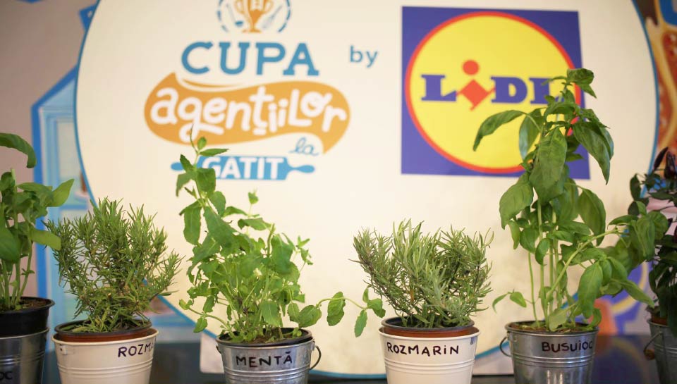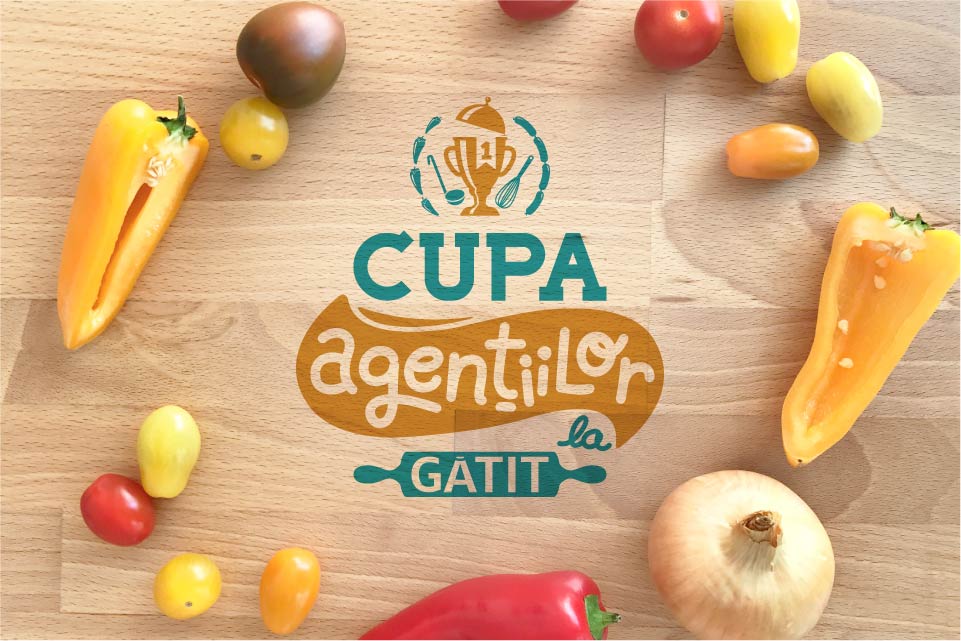
Agencies’ Cooking Cup
Branding
Brief
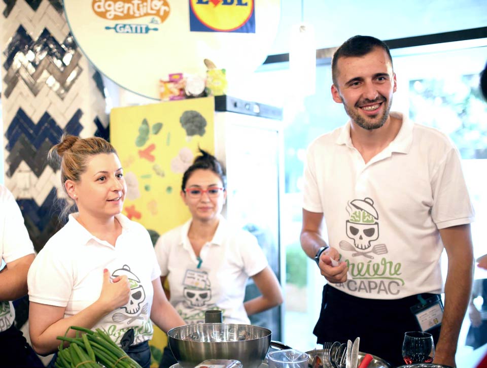
Agencies’ Cooking Cup is a competition where advertising creative agencies compete against each other, in a contest filled with recipes, tricks and inspiration. The first edition took place in 2013, in Bucharest. The most important names in the marcom industry race for the “Cooking Agency of the year” title.
Considering the scale of the event and its thematic, it certainly needed a visual identity that could highlight the gastronomic meaning, but also the idea of a creative contest.
Solution
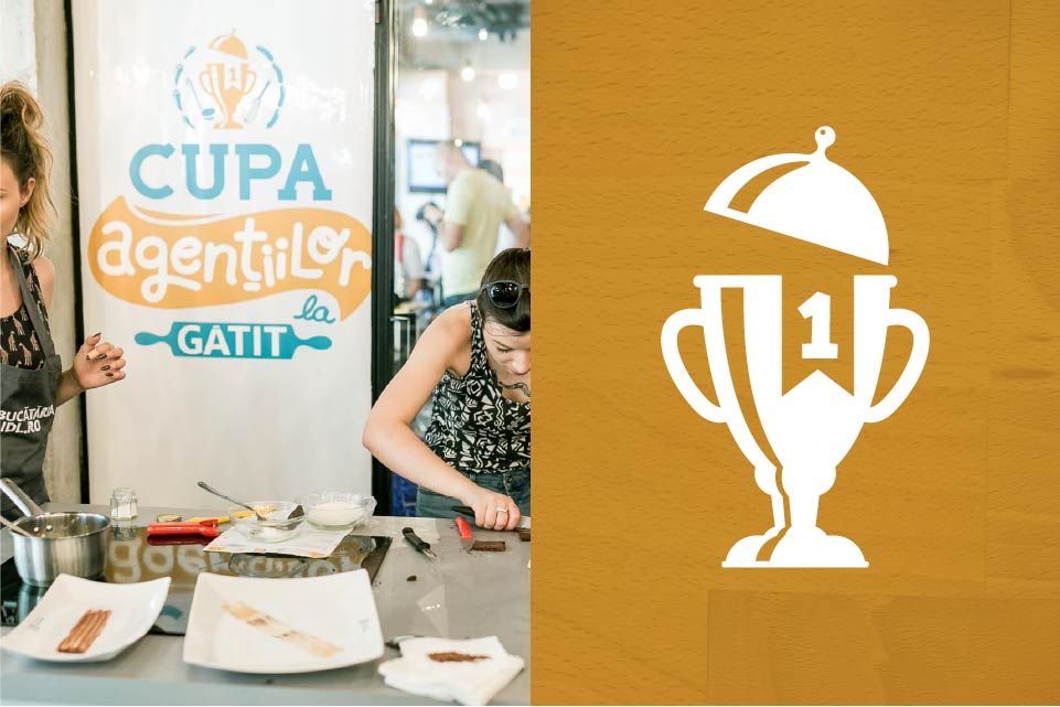
We wanted to spice up the visual identity, so we created a logo meant to transform the competition into a joust. The main idea is based on the contraction between chefs and their chosen weapons, such as the ladle and the whisk.
Chromatically, the chosen palette reflects a golden touch, a shade that strengthens the importance of getting this trophy. On the other side, we used a blue shade which is part of IQads’ colour palette. Why this blue? Because we had to temper down the intensity of the golden.
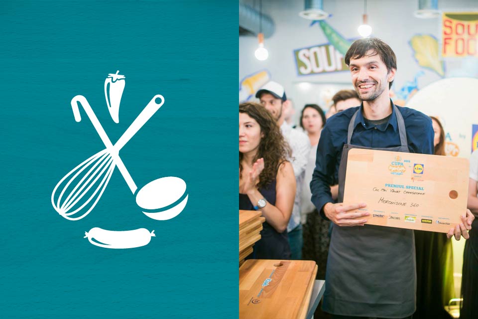
How did we create the logo? Well, we put together two opposite elements. First we have the straight letter and symbols, with exact values. Then we have letters and symbols manually crafted. The battle for such a trophy means you are able to discover the perfect mix between creativity and hard sciences, between chemistry and imagination.