Happenings
Branding, Webdesign, Collateral
Brief
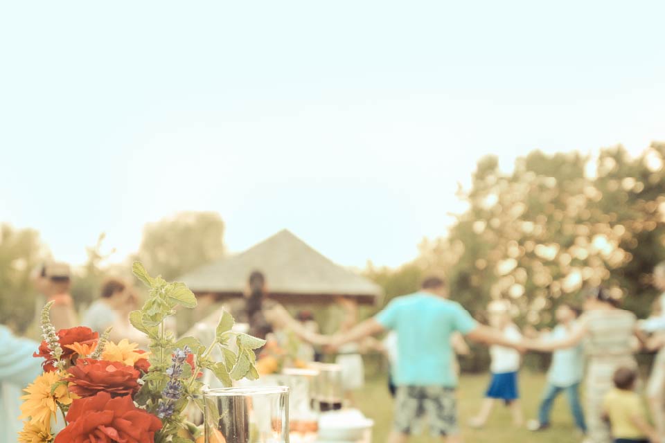
Happenings is that type of project which boosts us with its energy vibe, multicolored, with a concept and a design meant to bring people together. They are the architects of happiness, of any special moment and of the way these moments can be celebrated. It does not matter if where are talking about a personal and familial atmosphere or a corporate experience. Each event can be creative and memorable.
BrainUP accepted the challenge to create a fresh brand identity for a client clearly with some obvious creative skills. That’s why one of the most important talking points was our communication. More specifically, the feedback we received during this collaboration and relating it to our ideas and strategy.
Solution
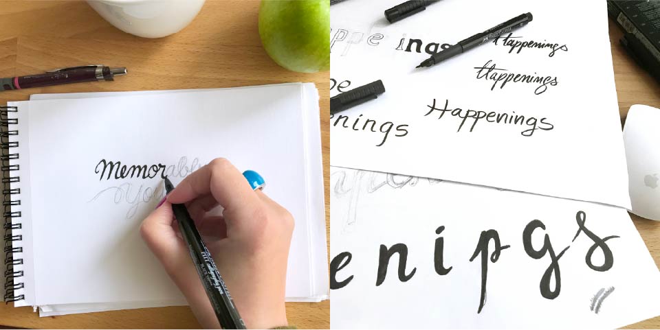
In order for an event to be successful, you need much more than its usual unfolding. During any event you need pleasant and unforgetable happenings. This is exactly what inspired us choosing the name of the brand. “Happenings” is the English word that stands for an event, a happening.
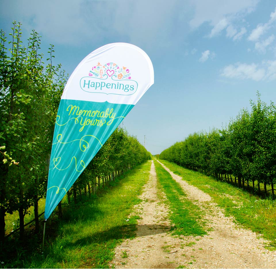
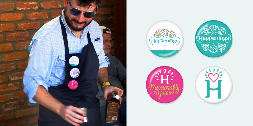
The visual identity was structured as a combination of things that bring people together. Chromatically, the palette we used suggests warmth and joy. The logo was also created as a depiction of the ideal event setup. The champagne, the guitar, the cake, the invitation and the gifts, all these are illustrated and reunited under a graphic representation as a whole. Everything comes together with the vibrant illustration of a heart, cause we all know how a successful event brings joy, intensity and energy.
The slogan had to highlight the idea of an unforgetable event, memories that clients will always enjoy. So we chose an English phrase: “Memorably yours”. It means memorable moments that are totally yours. That way we were able to keep the harmony of the general tone.


